Wednesday, August 15, 2018

Freedom on the decline in the U.S. Really?


Oh, no! Freedom in the U.S. is declining! How do we know that? Freedom House says so. My favorite website for visualizing freedom around the world shows freedom in the U.S. declining starting in 2016. Hmmm....who was elected that year?

Their reasoning is, to put it mildly, spurious. Okay, it's a crock of crap. Essentially it's a list of left-liberal talking points about Donald Trump and—without any evidence—how he has supposedly reduced freedom in the U.S.; and they have a survey of opinions to prove it! Those glorious opinions are so much more persuasive than facts and logic. The summary of why they reduced the score from 90 in 2016 to 86 in 2018 is:
The United States’ political rights rating declined from 1 to 2 due to growing evidence of Russian interference in the 2016 elections, violations of basic ethical standards by the new administration, and a reduction in government transparency.
Never mind that Russia has "interfered" in every U.S. election going back several decades but, as with the 2016 election, the evidence shows it has had no consequential effect. Freedom House ignores, of course, the incontrovertible evidence that the Clinton campaign colluded with Russians in a misinformation campaign ("opposition research") on then-candidate Trump, almost all of which was false.

And whatever Trump's supposed "violations of basic ethical standards"—standards known only to Freedom House—they have not reduced freedom in the U.S. in any way whatsoever. That's the beauty of the Constitution's restrictions on government power, which, incidentally, haven't changed in—wait for it—over TWO CENTURIES, regardless of who has been elected President. Frankly, it's hard to imagine a worse violation of basic ethical standards than former President Obama conveying to Vladimir Putin through Russian president Dmitry Medvedev his "flexibility" to remove defensive missile installations from Poland after the 2012 election is over; high on Moscow's wish list to incapacitate its opponents. Obama won't do anything during an election year because it might hurt his chances at re-election as Americans see he kowtows to Moscow. He is the consummate politician: saying one thing to please the electorate while intending to do the opposite.

The last point about a "reduction in transparency" is a flat out lie. President Trump has done exactly the opposite. He has increased government transparency and accountability, requiring agencies under his direction to be more forthright about their rule-making processes and—in the case of the EPA—publishing the the scientific studies they claim support their rules; something they never did before. President Trump has been a vocal and energetic advocate of "draining the swamp" in Washington D.C. and he is doing exactly that, despite the overwhelming bureaucratic and institutional inertia working against him.

The upshot of Freedom House's arbitrary down-ranking of the U.S. is that countries which have essentially no protection for freedom of speech score higher than the U.S. (86), like Canada (99), Australia (98), New Zealand (98), the U.K. (94). The U.S. has arguably the strongest protection of freedom of speech of any democratic republic. It's enshrined in the FIRST amendment of the Constitution. There have been several recent high-profile cases in the U.K. (see also here) and Canada (also here and here) where people have been fined or have gone to jail because what they said was offensive to others. U.S. courts have repeatedly struck down defamation cases in deference to the First Amendment's protection of speech. So Freedom House puts the freedom score for the United States just above Poland (85), Mongolia (85), Romania (84), Ghana (83) and Argentina (83). Pretty funny, Freedom House.

Contrary to the silly reasoning given by Freedom House, in the last 17 months, President Trump has increased accountability of the agencies under his direction and returned power to the people; power that was taken away by bureaucrats in those agencies under previous administrations. He has instituted an investigation of voter fraud; fraud which erodes the democratic process. He has increased health insurance choice and worked to reduce or remove tariffs on American goods by countries professing to favor free markets. He has strengthened support for NATO and our allies and aggressively acted to economically isolate the enemies of freedom like Iran, North Korea, and Russia. Yes, Russia.

Here is a list of Trump accomplishments in the first 500 days in office. It's obvious that he has done much more to strengthen freedom in the United States and around the world than his predecessor. But you wouldn't know that from Freedom House.
Friday, July 20, 2018

Current Data on Climate Change

Almost all the predictions about climate change are based on remarkably inaccurate computer-generated climate models, not on climate measurements. The predictions don't match measurements.

See also here for more recent comparison of models to measured temperatures (June 2020).

The best aggregate resource for current data and time series is at the Watts Up With That website Reference Pages. The website is skeptical of climate change claims, but the reference pages and graphs all link directly to the climate data of various climate science organizations.

Here are a few links to websites of climate measurements, all from prominent scientific organizations.

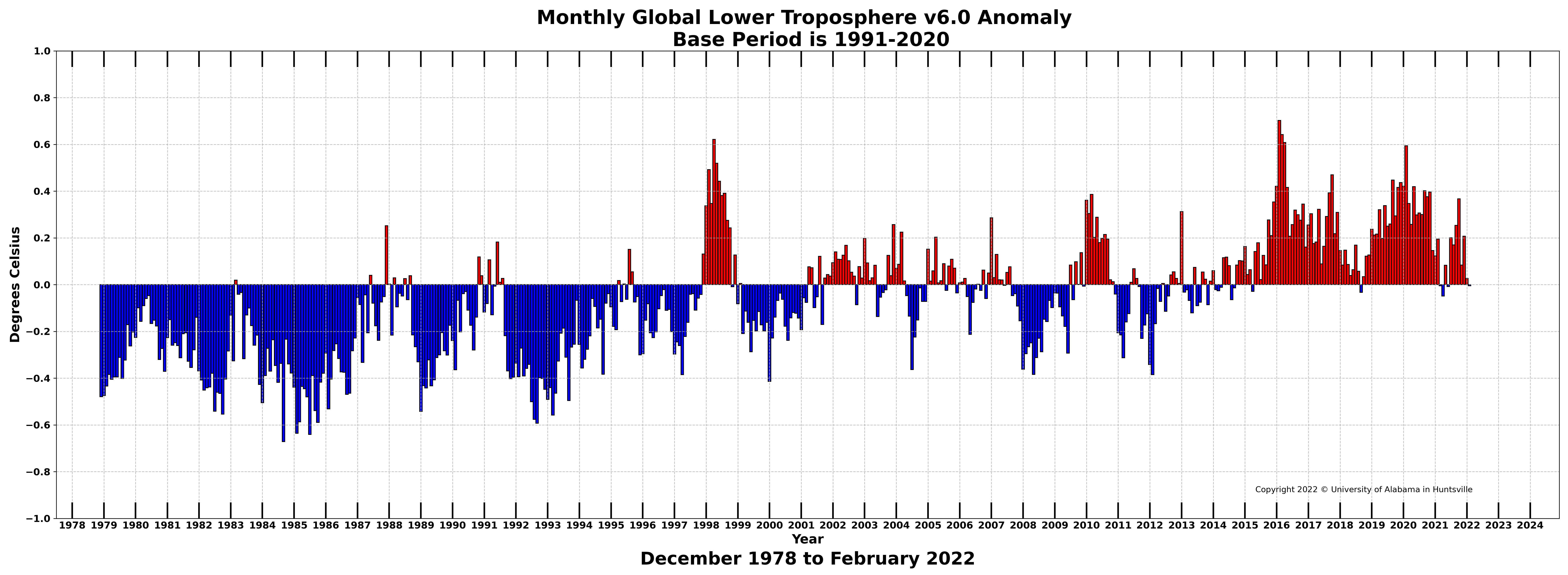
Global temperatures measured by satellite, 1979–present

Global Temperature Report (UAH)

Remote Sensing Systems (RSS) Upper Air Temperature Time Series

RSS Air Temperature website

Global temperatures measured by ground stations, 1850–present

HadCRUT4 temperature

NASA GISTEMP

Berkley Earth Land and Ocean Data

NOAA Global Time Series

NOAA National (U.S.) Temperature Index Time Series

Global sea level rise measured by satellite, 1993–present

Global Mean Sea Level Time Series (CU)

Global sea level rise measured by tide gauges, 1807–2013

NASA Vital Signs: Sea Level (satellite and tide gauge)

Tide Gauge Sea Level (CU)


Climate Predictions are Based on Computer Models

It is not widely understood that almost all the dire predictions about climate change are based on computer-generated climate models, not on measurements of climate phenomenon. Here's a sample of publications:


The last two are massive reports widely accepted as accurate summaries of the current (at the time) state of climate science. All of their future predictions are derived from climate models, not projections of current measured trends.

Once you start to notice that the studies and news articles predicting some impending disaster from global warming often state something like "models predict..." or "based on GCM (Global Circulation Models) analysis..." or "CMIP simulations show...", you start to get a nose for sniffing them out and it becomes apparent that they are not studying measurements of global climate, they are studying climate simulations on computers.

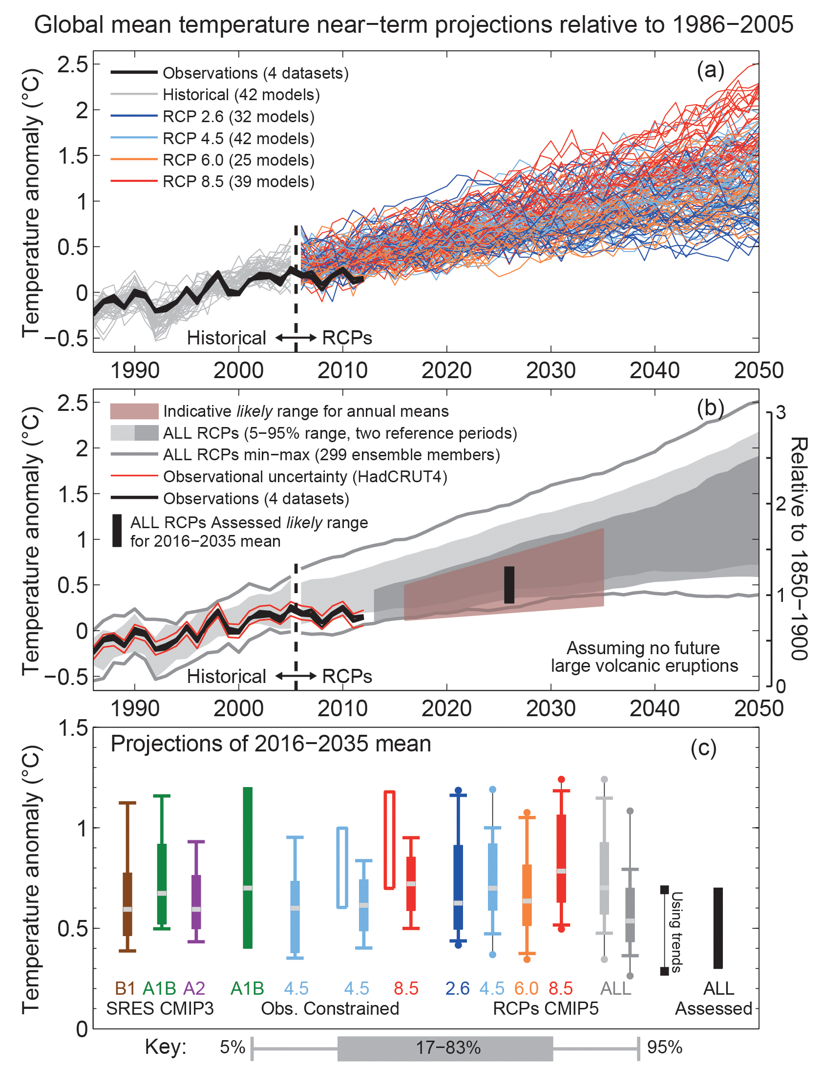
The CMIP5 simulations used in all these studies are, to put it mildly, inaccurate. Modeling something as chaotic and complex as the global climate isn't just a daunting task, it's impossible. As the IPCC AR5 report mentions in the glossary, "because the climate system is inherently nonlinear and chaotic, predictability of the climate system is inherently limited" (p.1460). IPCC AR5 has a graph on page 87 of the Technical Summary (PDF) showing results of CMIP5 simulations compared to global temperature measurements:

Figure TS.14, p.87 from IPCC Fifth Assessment Report (AR5, 2013)

You can see how quickly they diverge. (See more recent comparison here.) The climate models are based on the assumption that CO2 is the main driver of global warming so they have been built to model that, then refined to try and accurately represent recent warming prior to the 21st century. That's why they appear to track fairly closely to the measured warming over the prior 2 decades. But by 2007 you can see that they all predict more warming than is actually happening and they get worse over time. The CMIP5 temperature predictions go up steadily but measured global temperatures have not. There was a warming "hiatus" between 1998 and 2016.


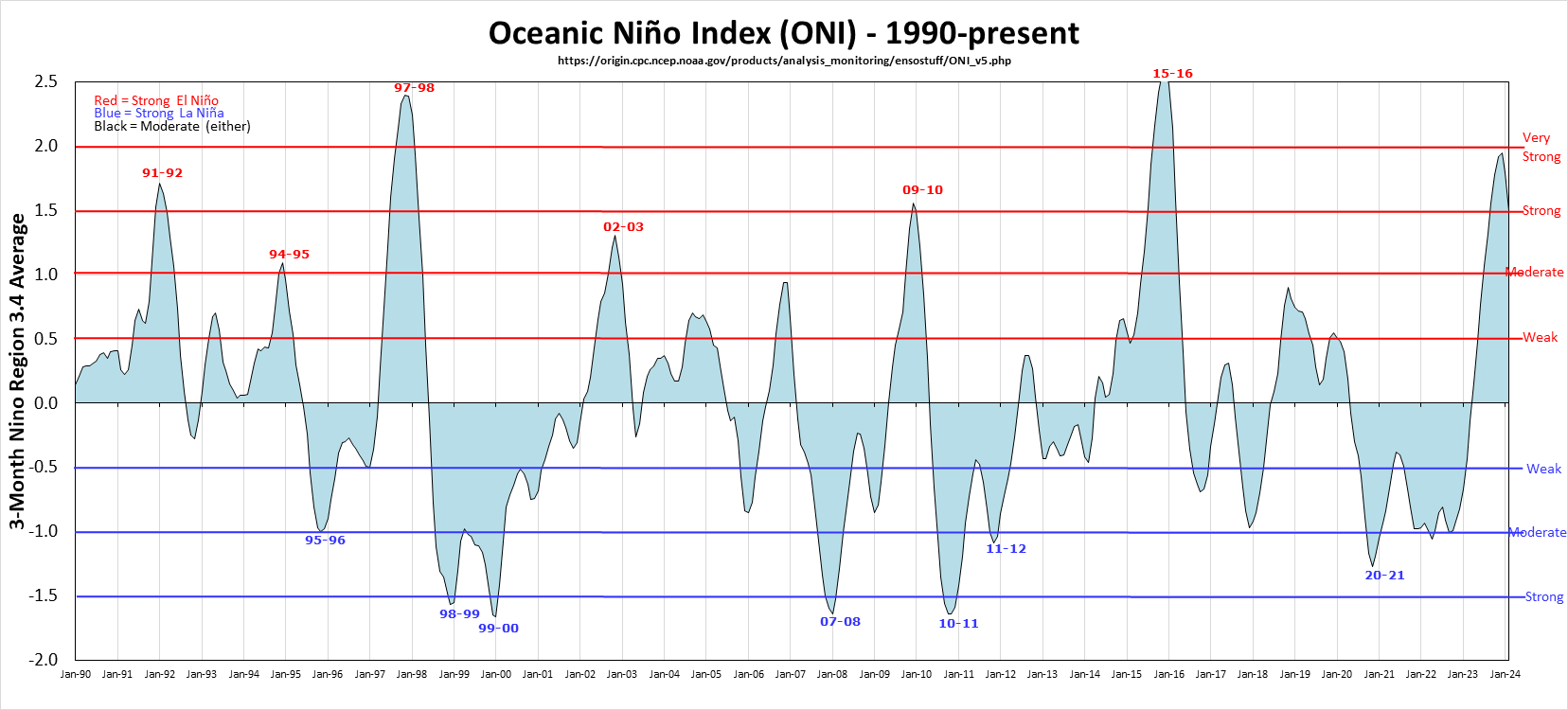
If you have trouble seeing that there has been essentially no warming between 1998 and 2016 just draw a horizontal line at the peak temperature in 1998 and notice that none of the subsequent years came anywhere close to 1998 until 2016. Coincidentally, 1998 and 2016 were years that had unusually large El Niños which you can see graphed here:

Oceanic Niño Index as of January 2022


The UK Met Office, one of the leading research institutions on global climate, has a helpful video explaining what the El Niño Southern Oscillation is. The U.S. NOAA has a video showing typical El Niño impacts on the United States. It appears that the influence on global temperatures of those large El Niños far outpaces any possible human contribution.

Despite confident assurances by climate scientists that global warming will continue indefinitely unless we do something to limit global CO2 emissions, the global average temperature has remained fairly steady over the last 20 years. It should be obvious that the results of any studies based on the CMIP5 models should be viewed with healthy skepticism.

Wednesday, June 27, 2018

Yet Another Sea Level Rise Apocalypse Not Happening

Some people like a suspenseful, scary story more than they like reality.

Rising seas: 'Florida is about to be wiped off the map' (The Guardian, 2018-06-26)

Coastal areas of Florida may eventually succumb to rising seas...in hundreds of years.

Perspective (and Data) Changes the Story

Check the NOAA Tides & Currents: Sea Level Trends map to see what local sea level rise is. In Florida it varies between about 2.1 and 3.7 mm/yr. The variation has a lot to do with land subsidence. The land in some areas—especially swampy areas or areas where groundwater is being depleted—is subsiding, adding to sea level rise. (In high northern latitudes the reverse is happening. The land is rising; rebounding from the massive glaciers that used to cover most of it.)

Hal, the geologist in the article frightening the handful of gullible folks who show up to see his dog and pony show, should know this but he probably enjoys the attention he gets from telling scary stories.

If you use an average of 2.7 mm/yr for the 15 stations in Florida it will take 370 years for sea levels to rise 1 meter (3.28 feet). That's not much and adapting to it isn't difficult if you have hundreds of years to adjust. Just ask the Dutch who have been reclaiming land from the sea for centuries by building dikes and draining the sea.

The story mentions that half the population of Florida lives less than 6 ½ feet (2 meters) above high tide. It will take 740 years for sea level to rise 2 meters. Florida is not "about to be wiped off the map". But the progeny of the current population, 32 generations from now, may have to move inland a little. Unless they do like the Dutch and engineer some practical solutions.
the (IPCC) expects roughly two feet of rise by century's end. And the (NOAA) estimates an upper limit of six and a half feet.
Yeah, but those guesses aren't based on real-world measurements. They're from computer models which are demonstrably inaccurate. The latest report, IPCC AR5, was published in 2013. In 87 years, at the current rate (depending on how you measure, by satellite or tide gauge), sea levels will have risen 148 to 278 mm (5.8 to 11 inches). That's a whole lot less than two feet. Or six and a half feet.
The rate of sea level rise is currently doubling every seven years
No it's not. In fact it appears to be doing the opposite: slowing down. You can see for yourself from the data collected by NOAA and other research organizations. NOAA and NASA keep decreasing the average rate of sea level rise they publish, from over 3.4 to 3.2 to now 3.1 mm/yr. How did Hysterical Hal come up with "doubling every seven years"?

Look at the University of Colorado's Sea Level Research Group data on sea level rise. And here are graphs from NASA's website of sea level rise measured by satellite and tide gauges.

Sea Level from Satellite Telemetry, 1993–2018. Rate is 3.2 mm/yr.

Sea Level from Tide Gauge Data, 1870–2013. Rate is 1.7 mm/yr.

The tide gauge data goes back almost 150 years. There appears to be an increase in rate starting about 1930, but only because there was no sea level rise over the prior two decades. The rate since 1930 shows no appreciable increase. The tide gauge graph shows a rate increase after 2000, but the satellite data does not. The discrepancies between the rates measured by tide gauges and satellites has nothing to do with sea level rise itself. It has to do with the accuracy of the instruments and statistical methods used to aggregate the data.

It's All About Context

From 1900 to 2000 the glacier on the screen retreated inward eight miles. From 2001 to 2010 it pulled back nine more; over a single decade the Jakobshavn glacier lost more ice than it had during the previous century. 
Sure, but missing important context. Glaciers retreat in response to warming air temperatures. They also retreat due to lack of precipitation (snow), geothermal warming under the glacier, meltwater running under the glacier, and how much of the tongue of the glacier extends into the ocean and the temperature of that water.  Jakobshavn is a dramatic example of a glacier losing mass; however there are glaciers in Alaska that have grown in size (Taku Glacier) while nearby glaciers have retreated, highlighting the fact that many factors affect glacier mass.  Changes in size (Columbia Glacier) do not necessarily correspond to global temperature changes.
“Greenland is currently calving chunks of ice so massive they produce earthquakes up to six and seven on the Richter scale,” Hal says as the city of ice breaks apart. “There was not much noticeable ice melt before the nineties. But now it accelerates every year, exceeding all predictions. It will likely cause a pulse of meltwater into the oceans.”
A favorite tactic of doomsayers and storytellers: paint an eye-catching visual image to highlight the drama, but leave out the context.

Greenland and Antarctica have been calving massive ice chunks for thousands of years but no one noticed because no one was around to notice. Now we have an increasing number of instruments and survey teams observing these events. The mass of the Greenland ice sheet has been measured regularly by satellite for only about 20 years now. We don't know how much it gained or lost mass over the preceding decades so we have no basis for making predictions. Ancient trees and forests are being uncovered under receding glaciers in Europe and North America. Glaciers in many places had receded more several thousand years ago than they have now; enough that forests thrived. To say ice loss "accelerates every year, exceeding all predictions" isn't a scientific statement. It's hyperbole. 

The bottom line, the measurement that matters, is sea level rise. That's what will affect people in Florida and all over the world who live in low-lying coastal areas. Despite all the claims of accelerating ice loss in Greenland and Antarctica, we don't see the supposedly accelerating ice loss noticeably affecting measurements of sea level rise.

More Context

And speaking of context, it should be no surprise that glaciers have generally decreased in mass globally in recent history because they've been doing so for the last 12,000 years since natural warming started melting the massive, mile-thick glaciers that covered much of the upper Northern Hemisphere.


If you go back before the previous glacial period to the peak of the prior interglacial (warm) period 125,000 years ago, sea level was 4 to 6 meters higher than now (13 to 20 feet). At the current rate, that will take another 1,600 to 2,400 years.

And Even More Context

If you really want some context, sea levels were 120 meters (394 feet) lower about 20,000 years ago at the coldest point of the last glacial period before the earth started warming and the continent-sized glaciers began to melt. The earth has experienced warming and cooling periods several times over the last million years, each lasting roughly 100,000 years with 25° C (45° F) global temperature variations and sea level changes of 125 meters (410 feet).


Notice that in the last 3 cycles the cold glacial periods lasted much longer than the relatively brief warm periods. We should be ecstatic that we don't live in a glacial period.

No one knows what causes these large-scale climate changes but Milankovitch Cycles are a leading contender. We live on a remarkable and dynamic planet.

Friday, March 23, 2018

Rampaging control freaks vs. helpful solutions

I ran across this anguished heart cry from a sanctimonious control freak agitated park visitor. Hiker shares photo after national park tour...